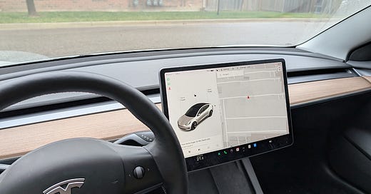
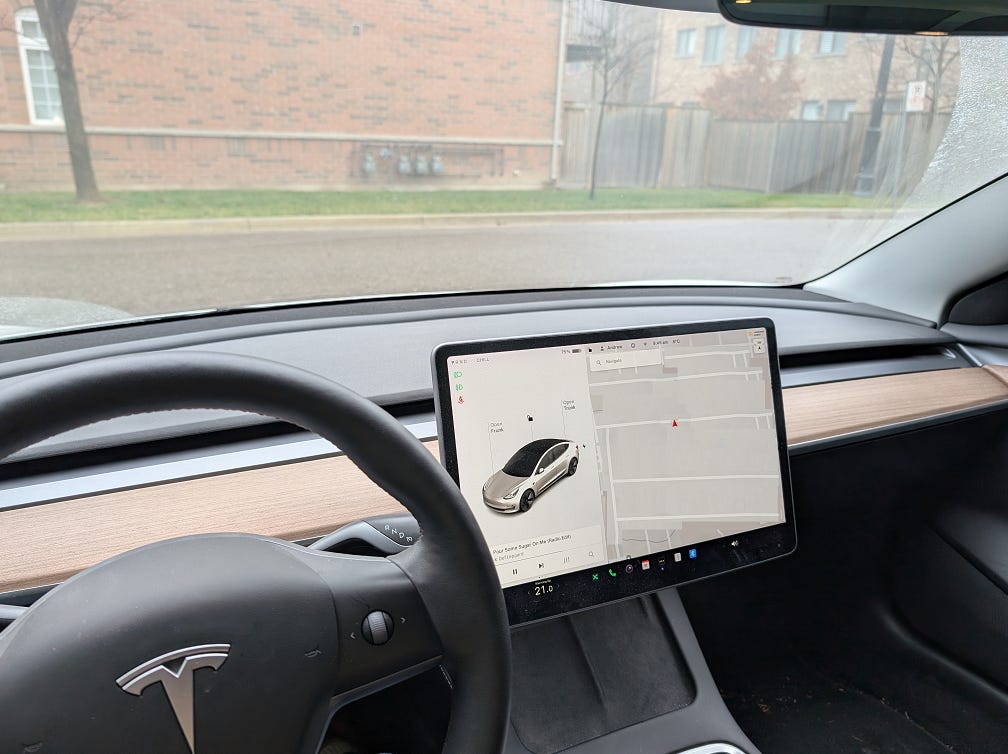
I drive a 2022 Tesla Model 3. If you’ve never been inside a Tesla, the interior may surprise you.
The dashboard is notable because it’s dominated by a giant screen. Or perhaps “dominate” isn’t the right word, since the dashboard is otherwise empty: there’s nothing there to dominate. The Tesla interface is less like a game controller, with analog buttons and switches, and more like a smartphone, with nested menus inside a touchscreen.
Is this good design?
There is no consensus on this question. Just this year, the head of software at Rivian, the all-electric carmaker, said that physical buttons in cars are outdated and should no longer be used. But just a few months earlier, in the summer of 2024, Hyundai announced that it is bringing back physical buttons in its cars. This decision was prompted by their customers, whom, Hyundai has said, prefer an analog interface. That announcement was roughly synonymous with Europe's main car safety organization, Euro NCAP, declaring that as of 2026, it would only grant its highest safety ratings to cars with physical controls.
I’m with Hyundai, and NCAP, and most users. Mission-critical car controls should be activated with buttons.
Safety Research Shows Physical Controls Are Safer
Touchscreens make driving more dangerous.
A moment’s thought reveals why. A touchscreen is just a pane of glass. As your finger scrolls across it, there is an uninterrupted feeling of flat smoothness. That feeling is consistent no matter what part of the screen you touch, and doesn’t give any indication to your finger as to what part of the screen you’re touching. (A designer would call this lack of haptic feedback.) The screen won’t buzz or vibrate as you slide your finger across any particular part of it; its feeling under your fingertip can’t change to rough or textured. It remains cool and flat.
This would be bad enough if the screen’s contents were consistent. But of course they are not; the advantage of a screen is that it can change. Generally, no space on the screen is always reserved for a specific control, except perhaps a home menu. Instead, pressing a control changes the image and context of the display. As users navigate menus through submenus, different parts of the screen do different things.
Consequently, touchscreen is a misnomer: a better name would be lookscreen, since it’s impossible to know what function you are adjusting without looking at it.
A closeup of my 2022 Tesla Model 3 display. Can you determine where to press to get to the windshield-wiper function?
Having found the button, how long did it take you to find the place to press to maximize wiper speed? Now imagine that you had to find it while driving a highway at speed during a rainstorm.
As a result, when important controls are moved to touchscreens, drivers must look away from the road to use them. This makes collisions more likely.
Recent testing by Vi Bilägare (a Swedish magazine for auto enthusiasts) in early 2024 shows the extent of the problem. They tested drivers at highway speeds (110 kilometers / 68 miles per hour) and found that using touchscreen controls to undertake basic tasks took up to four times longer than using physical buttons. That’s a sobering figure: in the worst car they tested, the driver was forced to divide attention from the road to controls while traveling more than 1.3km (almost a mile). In the car with physical buttons, drivers only needed 0.3km to do the same things.
It gets worse: some car designs force drivers to look down at steep angles to use the touchscreen, up to 56 degrees, compared to just 20 degrees for traditional controls. This dramatic difference means drivers must not only look away from the road longer, but also significantly tilt their heads downward, which creates two problems. Firstly, it takes longer to refocus when looking back up at the road. Secondly, this steep head angle temporarily reduces peripheral vision of the road ahead, making it harder to spot sudden hazards.
Looking away from the road is bad enough, but there are subtler, worse effects. Because of their variability, touchscreens make drivers think more about what they’re doing, to remember where the icons are for what they want to do. (A designer would say that touchscreens impose a greater cognitive load on users.) This additional mental work relative to physical controls impedes a driver’s grasp of the road ahead, and slows down their reaction time.
Poor ergonomic design can amplify the risk. For example, Tesla's Version 9 software made its touch targets smaller to fit more options in the menu bar. That allowed more choice at the expense of usability: smaller buttons are harder to press. Worse, they are harder to reach. Placing controls at the bottom of the screen requires drivers to move their hands farther from the standard ‘10 and 2’ grasp of the steering wheel, the optimal driving position. A longer reach and a smaller target taxes both the driver’s attention and control.
Physical controls, by contrast, are both permanently fixed in place, and offer haptic feedback: a fingertip run over the dash can identify switches or controls by feel. Drivers often can use them without looking, just by feel and memory, and keep their gaze and attention on the road.
More could be said—most touchscreens won’t work with gloves, and they produce glare in bright sunlight, meaning they can be even harder to use in both winter and summer—but the point is established. Euro NCAP and similar organizations are skeptical of touchscreen controls because they are less safe to use.
How do users feel? According to recent industry data, a strong majority of drivers, a full 86% of them, want touchscreens in their cars. I’m not surprised: drivers under 35 are digital natives who grew up with iPods, smartphones, or tablet computers. For them, touchscreens are just a feature of the modern world. For a car not to have them would seem strange. That said, upon inspection that majority is made up of a variety of opinions; only a third of drivers want touchscreens only. Most (52%) prefer a mix of touchscreens with physical buttons and knobs.
These nuances help to explain why there is such a range of approaches to touchscreens among manufacturers.
The Minimalist Aesthetic
Which firms are in the ‘touchscreen only’ camp?
Tesla is. So is Rivian. These firms seem to believe in touchscreens as a design statement: touchscreens, and absence of buttons, create austere internal environments that suggest values like clean, modern, uncluttered.1 I was surprised to discover while researching this article that, in the two years since I bought one, Tesla has updated the design of the Model 3 to eliminate stalks on the side of its steering wheel. Most cars, of course, use stalks for signaling lane changes; in a new Model 3, you must either use a touchscreen for this, or press buttons on the steering wheel.
Image of a 2024 Model 3 steering wheel, courtesy of Tesla.com. Note that, counterintuitively, the right turn signal is on the left side of the wheel.
This change exemplifies, in my mind, the philosophy at work here: design that prioritizes minimalism over functionality… especially if that functionality might be described as ‘traditional’.
On the Genexus blog, they report a conversation they had with Javier Verdura, then Tesla’s Director of Product Design. Verdura said:
If we’re in a meeting and we ask, ‘Why are the two headlights on the cars shaped like this?’ and someone replies, ‘Because that’s how they were designed when I was at Audi,’ that’s the worst thing you can say. This means we’re telling how things are done at other companies that have been doing it for years without innovation. For Elon, everything we do must be started from scratch, stripping everything down to the basics and starting to rebuild it with new notions, without worrying about how things are normally done.
This approach might seem attractive… to someone who has never heard of Chesterton’s Fence, at least. Those who have heard of it might ask first whether steering-wheel stalks were designed as they are for a reason, and whether forcing a driver to change lanes with steering-wheel buttons will leave them worse off.
It certainly seems like this is the case. In their review for Edmunds, “Our Tesla Model 3's Turn Signals Aren't Just Dumb, They're Borderline Unsafe”, one writer notes that "I spent the first 10 minutes of my commute trying to swipe a stalk that wasn't there, and then I spent the next hour regularly missing the button I was trying to push and having to look away from the road to make sure I hit it properly." Another adds, "I don't necessarily mind the concept of buttons… It's the execution of the design that is faulty. For two reasons: (1) The button surfaces are smooth, so you can't intuitively feel where your thumb is supposed to go, and (2) you have to press them just right, otherwise they won’t activate the turn signal.”
Controls Should Be Maximalist
A friend recently told me about the birth of modern ergonomics, which happened in an unlikely place: with B-17 warplanes in the 1940s, whose pilots kept crashing them while bringing them in to land. Why did this keep happening? The initial explanation was ‘pilot error’. Upon investigation, military psychologists discovered a more nuanced explanation, namely ‘design error’.
The B-17 employed standardized controls; partly to suit efficient, cheap wartime construction, but partly because no one had ever considered any alternative. Consequently, the lever to deploy the landing gear was the same as, and placed adjacent to, the lever to lower the wingflaps. Fatigued pilots were confusing the two; and so, immediately before they touched the ground, they were making their planes suddenly accelerate downwards, and so colliding hard with the runway.
Confronted with the problem, the psychologists redesigned the levers, so that each had a unique shape, and one that suggested its purpose. The landing-gear lever sported a knob that made it feel like a wheel, while the flap-control lever was capped with a wedge. As a result of these changes, pilot confusion ceased, as did this kind of accident. This was the beginning of the design principle of ‘shape coding’.
Shape coding is precisely what touchscreens fail to offer.
As this story suggests, good design is maximalist: the more dangerous a device is, the more simple, intuitive, and unambiguous its controls should be. Let me give credit where it is due: Tesla and Rivian are leaning into voice control, which satisfies all three conditions. (Figure 8 in the image above is the Model 3 button that activates this feature). I like this approach, as it not only keeps eyes on the road, but hands on the wheel. It must be said, though, that while it is indeed simple, intuitive, and unambiguous, it lacks a fourth quality that is equally necessary: it is not reliable. The Vi Bilägare study didn't include voice controls in their testing. This was a deliberate choice on their part; because such features work so inconsistently, they didn’t rise to a level to be worth testing.
I understand their perspective. My own Tesla Model 3 nominally permits voice control of many features, but in the months after my purchase, the voice control was so buggy and so laggy that I gave up. These days I don’t even try to use it, having been trained by the car that the feature will disappoint.
So much for Tesla and Rivian. What are other firms doing? BMW, Mercedes-Benz, Hyundai, and Kia are aiming for a middle ground, using both touchscreens and physical controls. For example, BMW's latest cars pair a large touchscreen with a physical dial controller and separate buttons for climate control. Mercedes-Benz keeps physical controls on their steering wheels so drivers can use screen features without taking their hands off the wheel. (Ferrari and Lamborghini also eschew stalks in favour of turn-signal buttons on the steering wheel.) This approach suggests to me that they are striking a balance between minimalist aesthetics, which they seem to believe modern buyers expect, and a straightforward driving experience, especially the higher-end vehicles where that experience is one of the vehicle’s selling points.
Against these, companies like Toyota, Honda, and Porsche retain physical controls, leaning into reliability, familiarity, and tradition. It’s striking that this conservative approach, which Hyundai has returned to, is shared by both mass-market and luxury brands: the value in maintaining proven interface designs is not limited to a single target market.
We Have to Go Back
I sympathize with Tesla and Rivian’s desire to put touchscreens in their cars. Upon buying my own Model 3, I immediately fell in love with the vehicle’s navigation system: thanks to the Tesla’s large touchscreen, it’s easy to operate, and has dramatically improved my driving experience.
But I note that I tend to set up navigation for my trip at the beginning of my trip, before putting the car in motion.
That makes the touchscreen the right tool for that job. It excels at it, as well as giving me other valuable information, like the current charge in the battery, or the PSI of my tires, and more. But I’m glad that, for my model at least, I don’t need to rely on the screen for core driving functions where safety is paramount. The fact that other automakers are shifting, loudly and proudly, back toward physical controls for critical functions suggests that they, and their markets, understand this.
One day we’ll have privately-owned vehicles that won’t need a human interface for driving, or other safety functions, at all. (Though I’m not as confident as some are that that day is near at hand.) When cars can drive themselves, we’ll all be better off, because such cars will be safer drivers than humans are. Until that day comes, we human drivers need controls we can find without looking and operate without thinking. And, however retro and uncool they may be, that means analog controls.
I use the word seem advisedly; so far as I can tell, neither company has published any formal design manifesto that explains their philosophy explicitly.
While I am firmly in the button camp, the core reason that Tesla and Rivian remove physical buttons is not necessarily about aesthetics but cost and differentiation. One of Musk's recurring design principles is "The best part is no part". It saves a huge amount of time on having to design, source, validate, and successfully integrate stuff (chiefly, buttons). Legacy OEMs have a lot of infrastructure dedicated to supporting this, so it's easy for them to use. Replicating all that for a new company is only a drag on their engineering resources that doesn't impress consumers the way a touchscreen does. The equilibrium for this dynamic may be that luxury cars have buttons, while the vehicles more like appliances go as digital as possible, likely with some sensors getting better at just automatically doing things (windshield wipers, turn signals, etc.).
This is primarily why I won’t drive the Tesla - my ideal car would have both, for the reasons you mentioned.